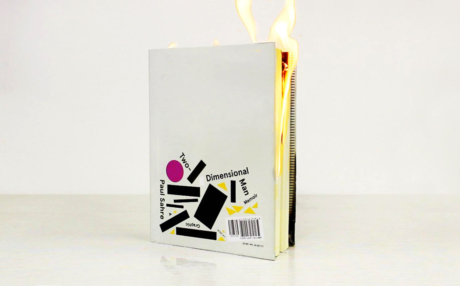


This is some of my inspiration for Paul Sahre… by Paul Sahre

I apologize for the blue splotch, the scanner didn’t want to shake it off…
I would appreciate any feedback!
Thanks,
Sam


This is some of my inspiration for Paul Sahre… by Paul Sahre

I apologize for the blue splotch, the scanner didn’t want to shake it off…
I would appreciate any feedback!
Thanks,
Sam
Great ideas Sam. You have a few sketches that look like they have great informational heirarchy: 1, 8, and 10 (thank you for numbering your sketches by the way). For all of these, I think the order of hierarchy feels appropriate: Artist Name, Series/Place/Location, and Artist Info. Be sure with 8 though that the viewer will be able to clearly understand his name. Unless it’s done properly and carefully, crossing over words like that can be confusing, especially since his last name isn’t as recognizable.
LikeLike
Agreeing with Christina, I think 1 & 8 are the strongest in terms of hierarchy. I’d like to see where option 8 can become.
LikeLike
what**
LikeLike