Hi, everyone! So I’m definitely in a pickle right now. I feel like I’ve kind of come to a wall, not really knowing what to do with my project. I keep looking the title, the table of contents, and the layouts over and over again, but I don’t know how to go about revising them further. I’m struggling to see what I should change to make them any better.


Any feedback would be extremely helpful. All I know is that I want my font book to have a radial theme and a crisp, clean layout otherwise. I do have a grid system, but one side of the spread is just a bit different from the other. Also, if anyone has a better title suggestion, I’m all ears!

Hey Molly,
Some suggestions I have would try to think of an alternate spread to create for every second page. even just inverting the color of every alternate page could make it more interesting.
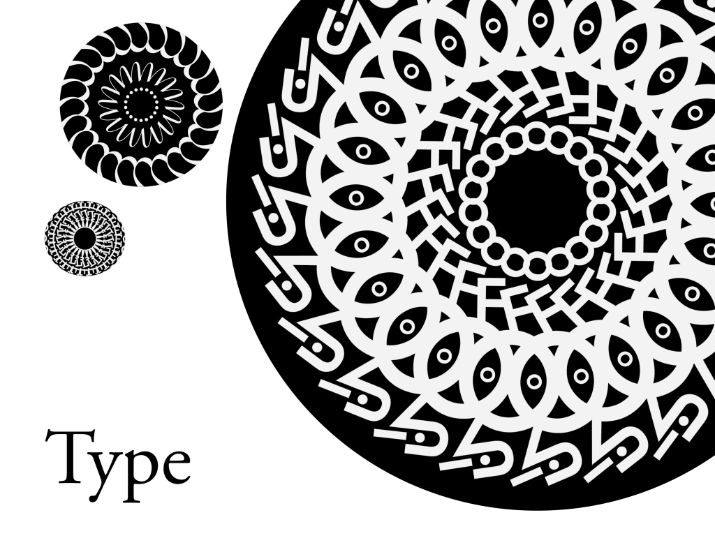
For your title, I think you can reduce the size of the largest circle a bit and enlarge the Title as it is very much overshadowed by the radial designs.
In your table of contents page, I would suggest moving the right circle a little lower and possibly reducing the size to lessen the tension there and make it more engaging.
Something you could try is to make other designs instead of just radial symmetry to have between the spreads. It could lead to something interesting or not but it would be something you can try I think.
Hope this helps a bit 🙂 This looks very elegant and sophisticated right now so I think you’re off to a great start.
LikeLike
I think you’re off to a really solid start. I don’t necessarily think you need to switch up your layouts from page to page, but that could also be because I’m also using a uniform layout for every page. I think it comes down to personal preference; uniformity in your layout across every spread makes your design stronger in my opinion. I really dig the radial designs you’re using to break up the space, I think they work really well with the lines that are used to box in the text, and it gives the page flow. Your table of contents is my favorite, I think there’s a really great sense of balance between the large radial designs and the placement of your text. I may be playing devil’s advocate here but I do think it’d be cool to see what those radial designs would look like with the colors inverted to get rid of the black circle, might be cool, might not be. Honestly I think you’re off to a really solid start.
LikeLike