A growing designer/illustrator, working on improving my art and learning the trade.
Always willing to help out and do the work :)
Working towards becoming a children's book illustrator.
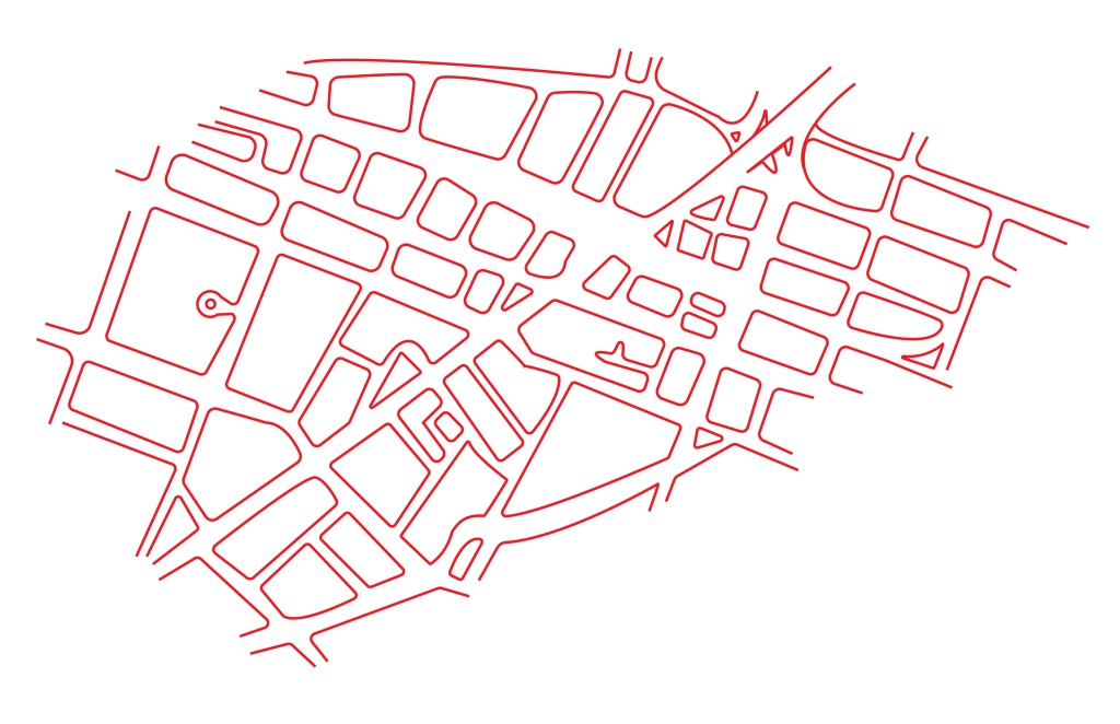
Heya! This is what I’ve finished til now. I’m still working on the icons for the big places so that’s why we currently have like 7 different Stanley Theatres in the city. I’m a bit stuck because I feel like there’s something I could change to make it better but I can’t place what’s off.
On a sidenote, the colors here are a LOT more saturated and neon than they actually are .
Heya, these are my sketches for the Map Project. I’ve attached the rough sketches and whatever I’ve started on Illustrator. Open to any comments, critiques and questions 🙂
My Map is going to be a map of the business district/downtown Utica and its going to feature the main places/sights of downtown utica as well as restaurants and cafes to go to.
Sketch of the layoutThese are the icons for the main places I wanted to feature on my MapMap of Downtown Utica done on Illustrator
This is the Icon I’ll be using to mark out restaurants in this area.
Heya, I’ve mostly finished a spread and the opening of my Data Booklet. The Bar Spread has only Saturday and Sunday Left and in the Other Spread I’m going to make Icons to represent each app under the notifications list.
Please let me know what you think and any feedback, comments, critique and questions you have.
Thank you!
This is a spread so there will be the binding in the middle.
Heya, These are my sketches for Assignment #6. I’m planning on doing like a mini Booklet with either a Darker Palate or the complete opposite, with a white and Pastel palate.
For this Assignment, I am planning on recording and visualizing my phone usage over the course of the entire week. I will be recording (1) Time spent on the phone, (2) What App I used the most, and (3) Possibly what reason I’ve been using it like out of boredom or with a purpose or curiosity etc.
Let me know what you think of these and if you have any ideas or alternate suggestions for me to try out.
Heya, these are my first 3 spreads for my type book. I’m alternating the pattern every alternate page as seen here. There are two copies added. One with the red box to mark where my inserts will be and one without. Please let me know what you think and if there’s anything you think I should change.
Heya! Here are some rough thumbnails for my Font Book. I personally really like the concept of the last one the most. Let me know if you have any suggestions or ideas for me to try.
Heya! I finished my paragraph iterations and was hoping to get some feedback on my top 4. Let me know if you have any critique and whether you think I should take one of them out.
I revisited my drafts based on some suggestions I got during class and switched everything up a bit. Please do let me know if you have any critiques and any suggestions to improve them. I don’t have any specific one in mind as a final yet so do tell me if any of these stick out more to you than the others.


You must be logged in to post a comment.