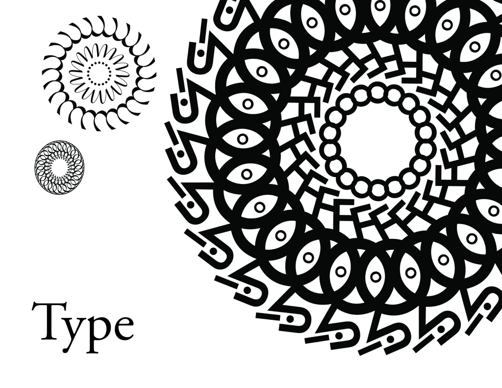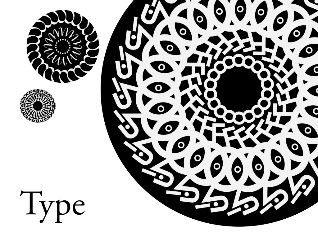


Based on some of the feedback I got on here, as well as from Christina, I managed to invert all of my illustrations and replace them.


Heya, these are my first 3 spreads for my type book. I’m alternating the pattern every alternate page as seen here. There are two copies added. One with the red box to mark where my inserts will be and one without. Please let me know what you think and if there’s anything you think I should change.


Thank you! 🙂
negative spaces will eventually be filled with some sort design/graphic that highlights specific characteristics of each type face (weight of serifs, stroke, etc). Also gonna have to relocate my page numbers so they don’t interfere with the text along the edge of my pages.


Hi, everyone! So I’m definitely in a pickle right now. I feel like I’ve kind of come to a wall, not really knowing what to do with my project. I keep looking the title, the table of contents, and the layouts over and over again, but I don’t know how to go about revising them further. I’m struggling to see what I should change to make them any better.


Any feedback would be extremely helpful. All I know is that I want my font book to have a radial theme and a crisp, clean layout otherwise. I do have a grid system, but one side of the spread is just a bit different from the other. Also, if anyone has a better title suggestion, I’m all ears!
Hello everyone,
I hope you’re enjoying your day off. Here’s everything that’s due for next week’s class:
Here are a few readings/talks I’d like to you also watch/read before class next week:
Emigre Type Foundry Pretty Much Designed the ‘90s—Here’s What it Looked Like – A little history behind the Type Specimens we’ve been looking at in class, and how Emigre has impacted design.
Google Wants to Make Web Fonts Accessible All Over The World – Discusses the Open Font License.
What These 4 Key Type Design Trends Mean for the Future of Fonts
This little quiz is just for fun: Which Typeface Are You, Really?
I plan on grading your paragraph assignments throughout the week and will be reaching out to each of you individually to let you know what your midterm grade is. Reach out with any questions!
Hey guys, so these are two separate pages that would slide under each other. Advice on the layout would be wonderful! Thank you!!!


You must be logged in to post a comment.