
Thumbnails for assignment 2
Thumbnails for assignment 2


Here are my thumbnails and drafts for my posters so far. Any comments are appreciated! I’ll also attach some images of some of the work by the artist I was inspired by.


Did 6 thumbnails, I would love to get some critiques on them before I make my first drafts. Thanks!


I tried to find a couple specific projects he’s worked on and use them as my inspiration. I worked off of three of his projects total. These are just idea thumbnails so any feedback/advice would be greatly appreciated. Thank you!


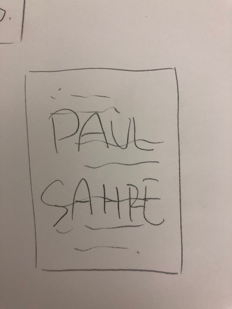
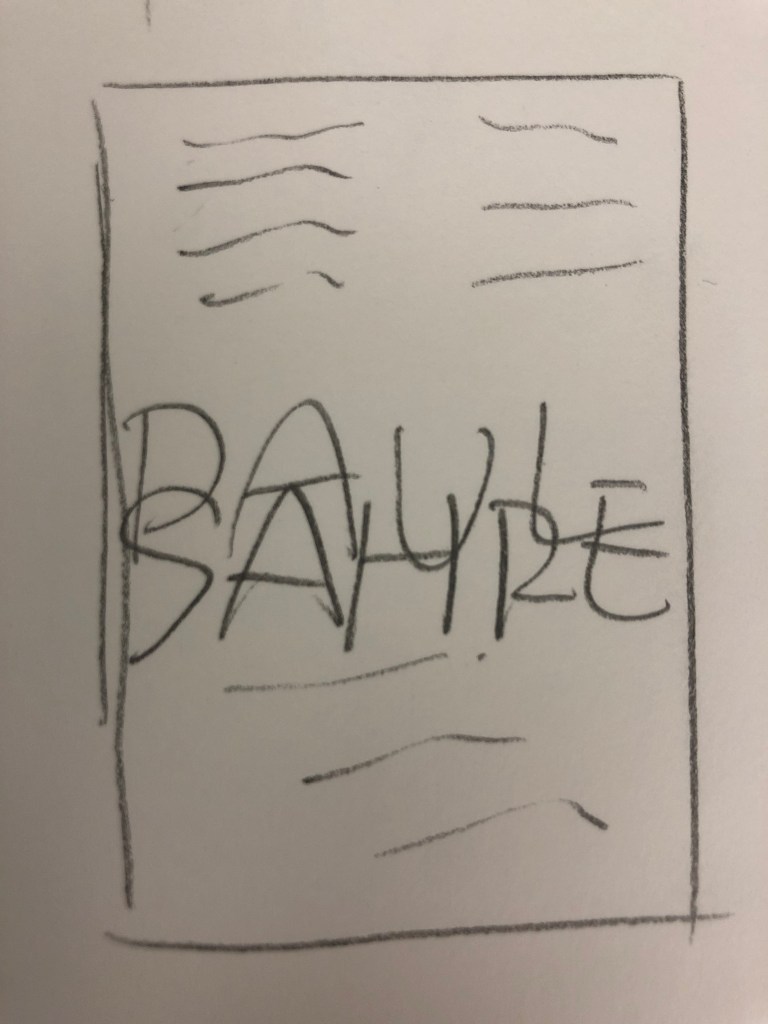
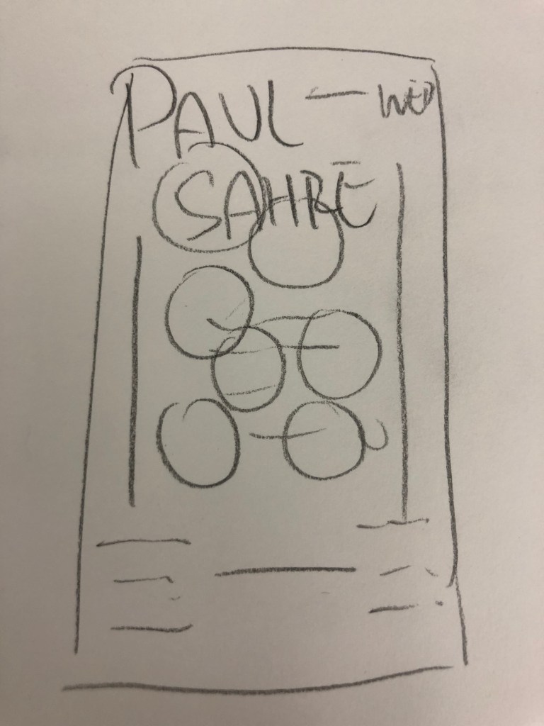
I’ve got a couple of sketches and rough designs done, not particularly married to any of them so any feedback would be lovely. I tried to focus most on mixing typefaces and taking a lil bit of inspiration from Paul Sahre’s style, he seems to love shapes and isn’t afraid to move text around.

Hey Everyone,
Here is what’s due before and for next week:
These are the fonts you are allowed to use for your Typography Poster Assignment:
See you all next week, and as always email me if you have any questions.


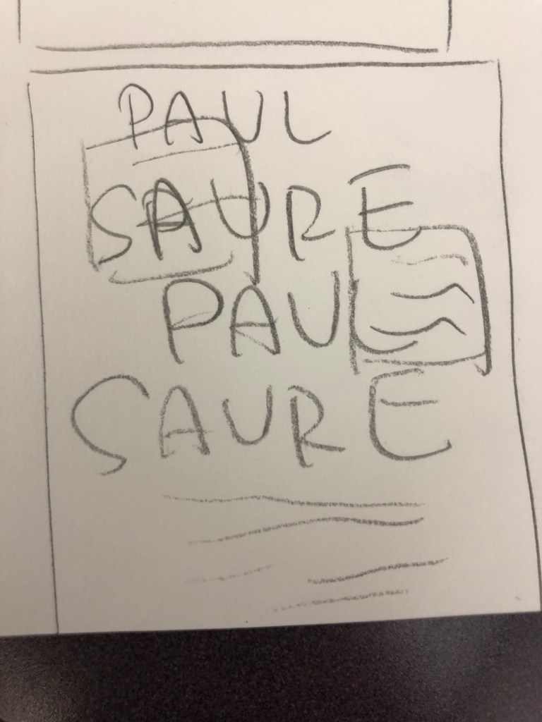
Here are the first (very rough) sketches!


And here are the colored compositions, including the text! Any feedback on which you all think is best and I should play around with more would be so much appreciated!

You must be logged in to post a comment.