these are my roughs for the poster. I used adobe instead of sketches as I find it better to visualize this way. even though it took more time I much prefer it this way. please let me know if the quality is bad.


these are my roughs for the poster. I used adobe instead of sketches as I find it better to visualize this way. even though it took more time I much prefer it this way. please let me know if the quality is bad.


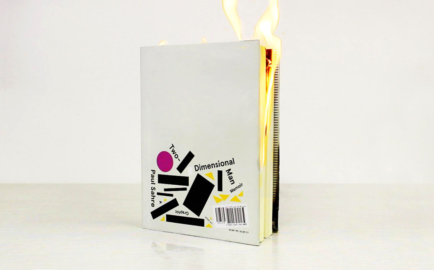
This is some of my inspiration for Paul Sahre… by Paul Sahre

I apologize for the blue splotch, the scanner didn’t want to shake it off…
I would appreciate any feedback!
Thanks,
Sam


Thanks.


Heya! Finished all the Iterations and was hoping for an final feedback and tips before printing the last two pages. Thank you 🙂


Hey again, guys! With the feedback I received, I tried my best to make some serious changes to my 3rd and 4th pages! I kept only a couple of the old designs and experimented with them some more in a second panel to see if I could find a way to make them more legible as well as less illustrative. (I also wanted to show my thinking process.) Let me know what you think for some final suggestions! Anything is helpful!

You must be logged in to post a comment.